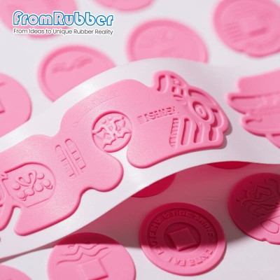
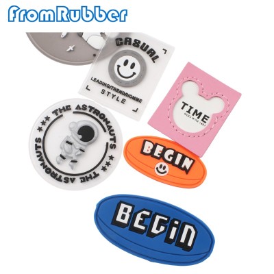
Small type is a moulding question, not a font question
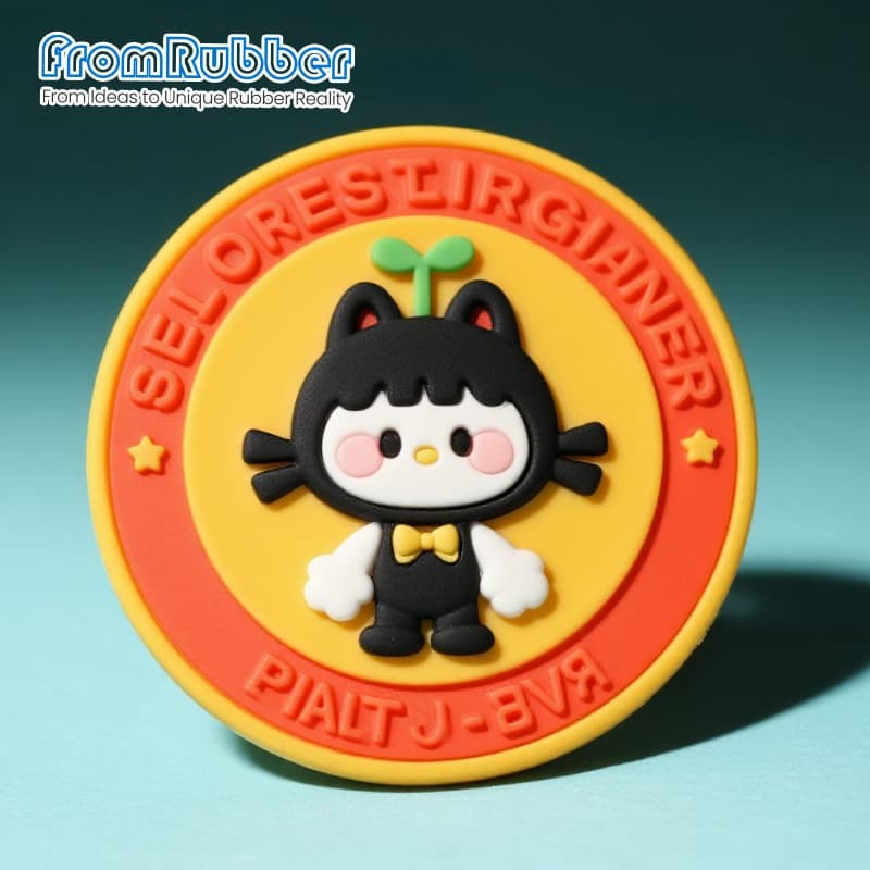
A ring of lettering around a patch looks simple in vector and is the hardest part to mould. Narrow strokes need a cavity that fills before the material cures, and a stroke that is too narrow will round over or fail to fill at the deepest point.
Three practical routes, in order of durability:
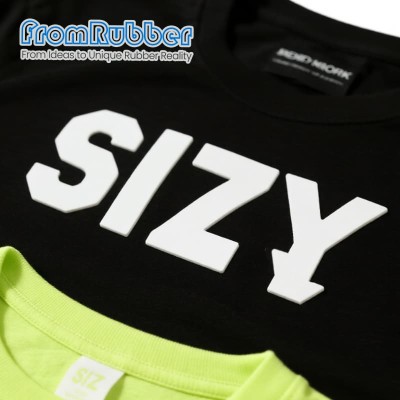
Moulded and raised — the lettering is a physical wall, colour runs through it, and it survives abrasion. Needs a stroke the tool can cut and fill.
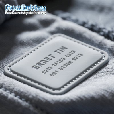
Moulded and recessed — letters sit below the surface, so the rim protects them. Reads best on a patch that will be handled constantly.
Printed on a flat land — the only way to hold very fine type, at the cost of a surface that wears sooner.
Send the vector and we will tell you which strokes have to change. Adjusting the artwork before tooling costs a file edit; adjusting it afterwards costs a tool.