5 Levels of Silicone Patch Design Complexity: From Simple Logos to Fine Details
The artwork looked sharp at 400 percent on a 27-inch monitor. The first moulded sample came back at 28 mm and half of the detail had quietly disappeared. Nothing was printed badly and nobody ignored the drawing. The problem was decided months earlier, when the artwork was scaled down and the smallest features inside it shrank below the point where the material and the tool can still resolve them.
Two silicone patches can share exactly the same outer dimensions and still require completely different tooling, sampling effort and production attention. A 30 mm patch built from one bold mark is a straightforward job. A 30 mm patch built from the same mark plus a hairline frame, two lines of 2 mm text and a two-colour split is a different project. What separates them is not the number of shapes on the screen. It is where the process runs out of room first.
Silicone patch design complexity is the combined effect of the smallest features inside a piece of artwork — the thinnest raised wall, the narrowest gap, the smallest text and the shallowest recess — measured at the patch's final size rather than at the size the file was drawn. This article groups custom silicone patch design into five practical levels of complexity, from a single bold shape to fine lines and small features, and explains what changes at each step. The five levels are an explanatory framework used here to organise the discussion. They are not an official industry grading standard, and a real project is judged on the complete artwork at its final size rather than on one feature in isolation.
Why Patch Size Alone Tells You Almost Nothing
Buyers usually describe a job by its outer dimensions: "a 25 mm logo, three colours, about 2 mm thick." Those numbers are useful, but none of them describes the part of the design that will cause the trouble. The values that actually decide the outcome are the ones nested inside the outline: the thinnest raised wall, the narrowest gap between two elements, the smallest text cap height, the depth of the shallowest recess, and the clearance between a fine element and the trimmed edge.
When a design is scaled down, every one of those internal values scales with it, and they scale silently. A 0.4 mm line in a 40 mm drawing becomes a 0.28 mm line in a 28 mm patch. The outline still looks right. The internal geometry is now a different engineering problem.
A useful way to think about complexity is that each level moves the bottleneck to a different stage of the process. At the simple end, the constraint is mostly layout: how shapes are arranged in the tool and where the parting line falls. In the middle, the constraint shifts to filling and separation: material has to flow into narrow gaps and vulcanise evenly, and adjacent surfaces have to stay visually distinct. At the demanding end, the constraint moves to registration and release: colours must line up within a fraction of a millimetre, and fine features must survive being pulled out of the mould without leaning or tearing. Same material, same machine, three different failure modes.
Three published engineering sources are worth keeping in mind here. Design guidance for rubber moulding notes that moulded elastomer parts do not hold tight dimensional tolerances the way metal or plastic parts do, because shrinkage during cure is less predictable, that parting-line flash cannot be eliminated entirely and therefore has to be planned around, and that 1 to 3 degrees of draft is a reasonable target wherever it can be included. Injection-moulding draft guidance makes the same point from the other direction, recommending at least 0.5 degrees on all vertical faces and noting that deeper features and textured surfaces need considerably more. ISO 3302-1:2014, which sets the dimensional tolerance classes and values for moulded, extruded and calendared solid rubber products, is the reference most often cited when a drawing and a moulded part are found to disagree. All three apply directly to a silicone patch, which is a small moulded part before it is a graphic.
Level 1: One Bold Shape, Few Decisions
Level 1 designs are built from large, immediately recognisable forms: a silhouetted symbol, a bold letter, a simple word mark, a basic geometric badge. Internal detail is minimal, colours are limited to one or two well-separated areas, and the shapes are far enough apart that the eye reads them without effort.
These designs are easier to assess because the mould designer has room to work. Boundaries are unambiguous, there is little risk of a small feature vanishing, and finished parts are straightforward to inspect against the drawing. That does not make every simple logo automatically easy. A bold mark squeezed into a 10 mm footprint, an unusual outline with tight internal corners, or a demanding attachment requirement can still create real constraints, and those still deserve a proper review.
What to prepare before asking for a quotation
- Vector artwork where it exists, with fonts converted to outlines.
- The intended finished width, height and thickness in millimetres.
- Whether the mark should read flat, raised or recessed.
- Colour references agreed in advance, not screen colours.
- The garment or product surface the patch will sit on, and how it will be attached.
The mistake that costs the most time
Enlarging a logo on a computer screen, judging it, and then approving a patch one fifth of that size. On screen the geometry is continuous; in a moulded part it is a set of physical walls, gaps and floors. Reviewing the artwork at actual size, on paper or on a sample, removes most of this class of surprise before tooling starts.
Bold silhouettes, wide strokes and clear separation between elements are what make a Level 1 or Level 2 patch predictable. In the family shown here, the mountain badge, the star, the shield initial, the wave and the single word bar all share the same property: the smallest feature in each part is still large relative to the part itself. That ratio, rather than the outer size, is what the tool has to reproduce.
Even at this level, the outline geometry matters. Rounded corners release more easily than sharp internal ones, and a shape that thins to a point somewhere along its silhouette will be the first place to lose definition.
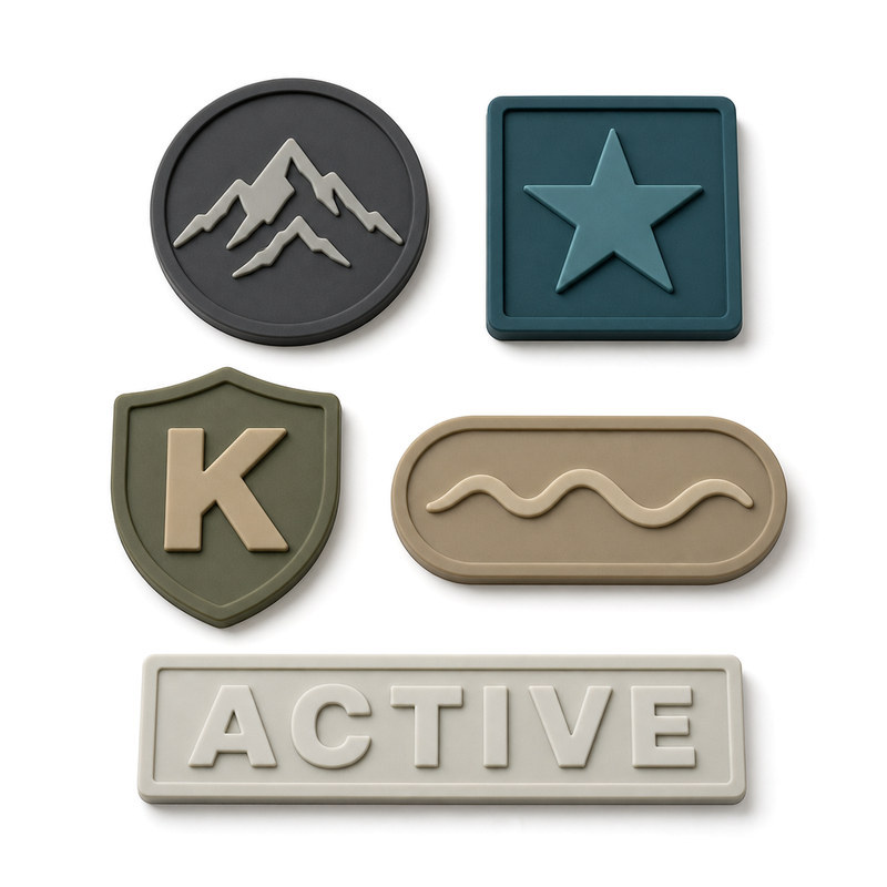
A family of low-complexity moulded silicone patches: bold geometry, wide strokes and no hairline detail.
Level 2: Letters, Symbols and a Second Element
Level 2 starts when the design has to say something rather than just show a shape. Lettering is added, or a border, or a small symbol placed next to the mark, or two separate elements that must sit in a fixed relationship to each other.
Each of these additions creates its own constraint. Character size and typeface choice decide whether text survives moulding at all: letters with enclosed spaces such as a, e, o, p, R and B need their counters to stay open, and a condensed light typeface has very little material behind each stroke once the part is small. Minimum line width and spacing become active questions rather than assumptions. Alignment between text and graphic elements has to hold in the tool, not just in the file. Where two colours are involved, the boundary has to sit somewhere the process can place it reliably.
The practical consequence is that extremely small text may lose clarity, particularly when strokes and gaps become narrower than the process can reproduce consistently. The fix is rarely "make the whole logo bigger." It is usually to change the letterform, widen the spacing, or drop a decorative element that carries no brand meaning.
Judge the artwork at production size, not screen size
A printout at 1:1 on paper is a far better proxy for the finished patch than a magnified preview. It costs nothing, it takes a minute, and it catches the majority of level 2 problems before a sample is made. Better still, mark the features that must remain visible and leave the rest negotiable; that single decision turns a subjective debate into a measurable list.
Level 3: Several Colours With Boundaries That Have to Land in the Right Place
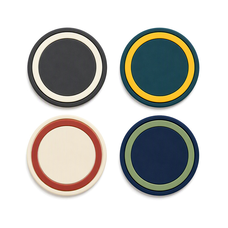
Concentric two-colour bands: the appearance is a clean ring, but the real work is keeping the boundary in the same place on every part.
Level 3 designs introduce multiple colours, segmented graphic areas or distinct visual layers. This is the level where the conversation usually shifts from "can it be made" to "can it be made consistently," because a colour boundary is a physical interface between two materials, and its position is a production variable rather than a drawing value.
Colour registration is the first concern. Two adjacent colour areas need a defined boundary, enough separation for each material to fill its own region, and enough process control that the boundary lands in the same place on part one and part ten thousand. Where the boundary runs through a curve or a ring, small positional drift is more visible than it would be along a straight edge.
It is worth separating two ideas that are often used interchangeably. A design can contain several colours without containing several physical layers; and a design can contain physical layers that do not differ in colour at all. Colour count and layer count are different variables, and they carry different process implications. Multi-colour silicone work is generally built either by forming different colour regions in one tool or by assembling separately formed elements, and those two routes have different boundary behaviour, different tooling implications and different inspection criteria.
Colour consistency between the approved sample and later production batches is the second concern. Screen colours are not a reference. A physical master sample or a documented colour standard is, and it needs to be agreed before the first part is made, not after the third shipment.
Questions worth settling before sample development
- How many colours are genuinely required, and which of them carry meaning?
- Do the colours have to meet at a boundary, or can they be separated by a gap or a neutral field?
- Is a slight positional tolerance on the boundary acceptable, or is the boundary a brand-critical line?
- Will the colour regions be formed together or brought together, and has the manufacturer confirmed that route?
- Which colour reference will be used for approval, and who holds the master sample?
The important caveat at this level is that multicolour feasibility depends on the construction and the process selected. It should not be assumed that every multicolour design requires the same tooling method, or that a design that worked in one colour system will transfer unchanged to another.
Level 4: Raised and Recessed Detail
Level 4 designs use physical height as part of the visual language: raised logos, recessed backgrounds, stepped surfaces, contrasting relief heights. The appearance is created by geometry rather than by colour alone, which is exactly why it is affected by light and touch as much as by the drawing.
The variables that matter here are raised feature height, recess depth, the definition of the edge where a raised area meets the surrounding surface, the transitions between different levels, and the overall thickness of the part. A raised wall that is tall relative to its width is more likely to lean during demoulding, so the wall arrives slightly uneven instead of crisp. A recess that becomes both shallow and narrow at the same time loses the shadow that made it read as a recess in the first place. A deep, narrow feature can be harder to fill evenly and harder to release cleanly, and it concentrates stress at the base of the feature.
Overall thickness then interacts with application. A thicker, more structured patch holds its geometry well on a flat, stiff panel. On a curved shoe surface, a tight-fitting sleeve or a body-contacting area, the same thickness changes how the part moves with the substrate, how its edges sit, and how it feels. Excessive relief can therefore create practical problems even when the design looks convincing on a screen, and the right relief height is a decision about the product, not only about the artwork.
Dimensional effects have to be assessed against the actual application requirements and the actual manufacturing capability, and those two answers can differ between suppliers using different tooling. A design that is comfortable for one tool set is not automatically comfortable for another.
Practical ways to reduce relief risk
- Set a target relief height and check it against the plan for thickness and flexibility.
- Keep raised walls and adjacent gaps proportionate to each other rather than thinning one in isolation.
- Use rounded transitions instead of sharp internal corners wherever the design allows.
- Confirm the depth that a recess needs before it reads reliably from the viewing distance the customer will actually use.
Level 5: Fine Lines, Small Text and Dense Detail
The most demanding group combines thin lines and narrow gaps with small lettering, intricate symbols, fine borders, closely spaced details, and occasionally several visual layers and relief heights in one small part. Individually each of these is manageable. Together they compete for the same limited space.
Overlapping outlines are a good stress test for this level. Where two thin lines cross, or run parallel with only a small gap between them, the geometry has to stay separate on every part, not just on the one that happened to be inspected. A crossing point is where separation is easiest to lose, and a run of parallel lines is where small individual losses accumulate until a detailed panel reads as a single grey field.
The same logic applies to a fine pinstripe frame around an oval or a rounded rectangle. The frame is usually the first element a buyer thins down to save space, and it is the first element that stops reading. If the frame carries the identity of the mark, protect it at the expense of something else.
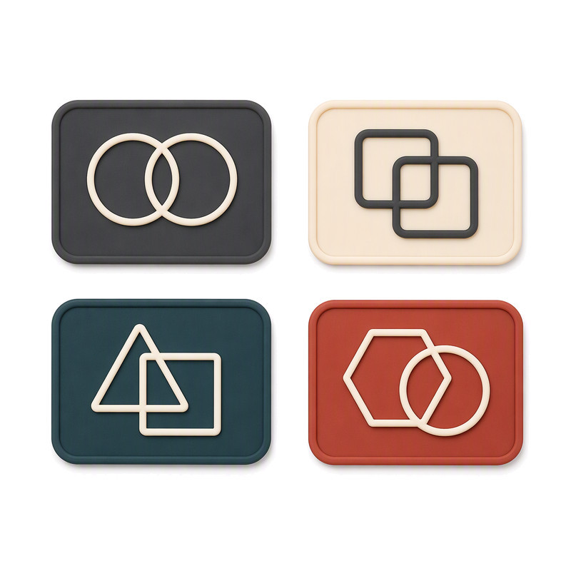
Overlapping hairlines: the crossing points and parallel runs are where fine detail is lost first.
The common risks at this level follow the same pattern. Fine raised lines merge or disappear. Small recessed areas lose their shadow and stop reading as recesses. Text drops below the size at which letters stay identifiable. Visual definition becomes uneven across the part, and results vary from one production piece to the next.
There is a strong temptation to answer these problems with a single number: a minimum line width, a minimum text size, a tolerance that can be relied on in every case. That number does not exist in isolation. Practical limits depend on the artwork, the finished patch dimensions, the silicone formulation and hardness, the tool construction, the surface finish and the production process being used, and two competent manufacturers with different tools can give different answers on the same drawing. What can be said with confidence is that the smallest absolute feature at final size is the value that matters, and that this value has to be reviewed at the size the part will actually be made.
Design adjustments that usually help
- Simplify or remove non-essential detail: decorative borders, secondary ornaments, micro-slogans.
- Increase the spacing between adjacent elements, which is normally cheaper to give away than line weight.
- Adjust line thickness rather than assuming the whole file must scale.
- Separate visual elements that are fighting for the same few millimetres.
- Change the letterform before changing the font size when text is marginal.
The Five Levels Side by Side
| Design level | Typical design characteristics | Main manufacturing challenge | Common design risk | Review before sampling |
|---|---|---|---|---|
| Level 1 | One bold shape, wide strokes, minimal internal detail, one or two well-separated colours | Tool layout and parting-line placement | A bold mark placed in an unusually small footprint, or an outline that thins to a point | Finished dimensions, thickness, and whether the mark should be flat, raised or recessed |
| Level 2 | A second element: lettering, a border, a small symbol, or two elements in fixed alignment | Reproducing strokes and gaps, and keeping text and graphics aligned | Small text losing legibility; condensed or light letterforms closing up | Artwork printed at final size, letterform and spacing, and which details must stay visible |
| Level 3 | Multiple colours, segmented areas or distinct visual layers | Colour registration and consistency across parts and batches | Boundary drift between adjacent colour regions; sample-to-batch colour variation | Colour count, boundary behaviour, agreed colour reference, and which construction route the manufacturer confirms |
| Level 4 | Raised logos, recessed backgrounds, stepped surfaces, contrasting relief heights | Filling, releasing and edge definition at different heights | Over-tall narrow walls leaning on release; shallow-and-narrow recesses losing their shadow | Target relief height against thickness and flexibility, and behaviour on the actual curved or flexible substrate |
| Level 5 | Hairlines, narrow gaps, small lettering, fine borders, dense or layered detail | Holding fine features separate and consistent across the whole run | Lines merging, counters closing, detail varying between pieces | Every thin feature checked at final size, plus a mark-up showing what must survive |
How to Make a Complex Patch Easier Without Changing the Brand
Simplification is often described as a compromise. In practice it is usually a reallocation: the same visual identity, given more room where it needs it and less where it does not.
- Start from the final intended patch dimensions and work inward, not from the design file and work outward.
- Supply vector artwork whenever possible, so the geometry is exact rather than traced.
- Identify the two or three features that carry the brand, and treat everything else as adjustable.
- Review line thickness and spacing at actual size, on paper or a physical proof.
- Separate colour requirements from dimensional requirements; they are decided by different parts of the process.
- Confirm whether raised or recessed detail is genuinely necessary, or whether contrast would do the same job more simply.
- Discuss the attachment method and the substrate before finalising the construction, because both can constrain thickness and edge design.
- Ask for a production-oriented design review before tooling, while changes are still free.
Removing a decorative rule, opening a gap by a fraction of a millimetre and widening one marginal stroke will often improve clarity more than any other single change, and the customer looking at the finished garment will not notice that anything was simplified.
What to Send a Silicone Patch Manufacturer
A manufacturability assessment is only as good as its inputs. The following list is what allows a meaningful answer rather than a guess.
- Artwork in AI, EPS, SVG or another suitable vector format, with fonts converted to outlines.
- Target width, height and thickness, in millimetres.
- Pantone or other agreed colour references.
- Whether a 2D or 3D appearance is wanted, and which features should carry the relief.
- The fabric or product substrate the patch will be applied to.
- The intended attachment method.
- Expected use and washing requirements, where relevant.
- Estimated order quantity and sampling expectations.
Complete specifications reduce the number of round trips during sampling, and they also make it clear which constraints are fixed and which ones the manufacturer is free to solve.
Questions Buyers Ask Most
What makes a silicone patch design difficult to manufacture?
Usually not the outer size. Difficulty comes from the smallest absolute features inside the design: the thinnest wall, the narrowest gap, the smallest text, the shallowest recess, and how much space those features have between each other and from the trimmed edge.
Can a small silicone logo keep thin lines and fine details?
Sometimes, and always conditionally. It depends on the actual line and gap values at final size, the silicone hardness, the tool construction and the surface finish. The only reliable way to answer the question is to review the artwork at production size and confirm on a sample.
Are 3D silicone patches harder to manufacture than flat ones?
Not automatically, but they add variables. Raised and recessed features introduce height, transitions and release behaviour, which then interact with overall thickness and how the patch performs on a curved or flexible substrate.
How does the number of colours affect silicone patch design?
Each additional colour adds a boundary that has to be placed and held consistently, and adds inspection requirements. Whether a design can be produced in a given colour count depends on the construction selected, so colour count and layer count should be discussed separately rather than treated as one number.
Should I simplify my logo before ordering custom silicone patches?
Simplify the parts that carry no meaning, and protect the parts that do. Widening the spacing between elements and removing a decorative rule usually costs nothing visually and can remove the single biggest source of sampling delay.
What files should I send to a silicone patch manufacturer?
Vector artwork wherever available, target dimensions in millimetres, agreed colour references, the substrate, the intended attachment method, expected use conditions, and a mark-up showing which details must remain visible. A brief note on quantity and sampling expectations helps too.
Where the Review Actually Pays for Itself
Design complexity is a sequence, not a verdict. At the simple end the part is limited mainly by how shapes fit into a tool. Moving through the levels, the limit shifts to filling and separation, then to colour registration, then to relief geometry, and finally to holding fine detail consistently across a whole run. Understanding which limit applies to a given drawing is what turns a vague risk into a specific design decision that can be made in an afternoon rather than discovered in a production batch.
FromRubber works on custom silicone patch and silicone label projects for clothing, footwear, headwear, bags and accessories, and reviews artwork, dimensions, visual detail and application requirements before sample development so that the constraints are identified while changes are still inexpensive. If a design involves fine lines, small text, multiple colours or deep relief, it is worth sending the file at its intended size along with the substrate and attachment method; a short feasibility discussion at that stage is usually faster than a sample cycle that has to be repeated. Artwork and requirements can be submitted through the FromRubber inquiry form, by email to nani@fromrubber.com or karl@fromrubber.com, or by WeChat and WhatsApp on +86 18676210913. Related reading on this site includes how to keep thin lines visible on a small silicone logo, design factors for silicone patches on seamless sportswear, and the multi-colour silicone and mould making capability pages.