How to Develop a Multicolor Silicone Sunglasses Sleeve for Your Brand?
A brand sends three colours, a logo and one reference photo. The first sample comes back with the right palette and the wrong product: the second colour bleeds into the first along a soft edge, the motif reads as a shadow instead of a shape, and the logo has filled in. Nothing about the design was unreasonable. It just assumed that colour is a graphic decision, when in silicone it is a material and tooling decision with a fairly hard limit.
Start With a Multicolor Design That Can Be Manufactured Reliably
The practical limit in moulded silicone is not how many colours a brand owns. It is how many colour boundaries the mold can shut off, how small the smallest colour area can be before it stops reading, and how many operations the part can survive before the cost stops making sense.
Decide Where Each Color Should Appear
Write a colour map before you write a mood board. Four questions: which colour is the body, which is the accent, which is the logo, and is there a trim colour. Then mark every boundary and say whether it is essential to the brand or simply pleasant.
A colour map is more useful than a reference image because it forces a decision about edges. A photo shows a result; a map shows the line where two compounds have to meet, and that line is the part a toolmaker has to build.
Choose Between Separate Color Components and Integrated Color Features
There are two honest routes to a two-colour product. Separate components - a body in one colour, a band, rim or strap in another - are assembled after molding. Integrated colour features put both colours into the same molded part, with the boundary controlled by the mold.
Separate components are forgiving: each part is single-colour, tooling is simpler, and a colour change later affects one component. The price is assembly, alignment and a visible joint. Integrated colour is cleaner in appearance and usually tougher at the boundary, but it needs a mold that can shut off precisely and a process window that keeps the second shot from contaminating the first.
Check Whether the Color Layout Works With the Sleeve Shape
Colour behaves differently on a curved shell than on a flat panel. A narrow strip that runs over the bridge has to wrap around a changing curvature, which means its width varies in the mold even when it looks constant in the render. Small colour blocks near the mouth sit in the highest-flow region of the cavity and are the first to distort.
The usual simplification is not to remove the colour, but to move it. A strip that starts 4 mm away from the opening costs far less trouble than one that terminates exactly on the rim.

How Should You Choose the Multicolor Manufacturing Method?
A Single-Color Molded Body With Separate Components
This is the most common route for a first branded product, and it is often the right one. The body molds in one colour, the strap or band molds in another, and the two are assembled. Tooling is split into two simpler molds rather than one complicated one, which usually reduces risk on a first run.
The thing to design for is the interface. Where the strap enters the body, is there a slot, a loop, a post? How much alignment variation can the joint tolerate before it looks like a mistake? A 0.5 mm mismatch on a small part is invisible; the same mismatch on a 20 mm band is a visible step.
Multicolor Molding for Integrated Designs
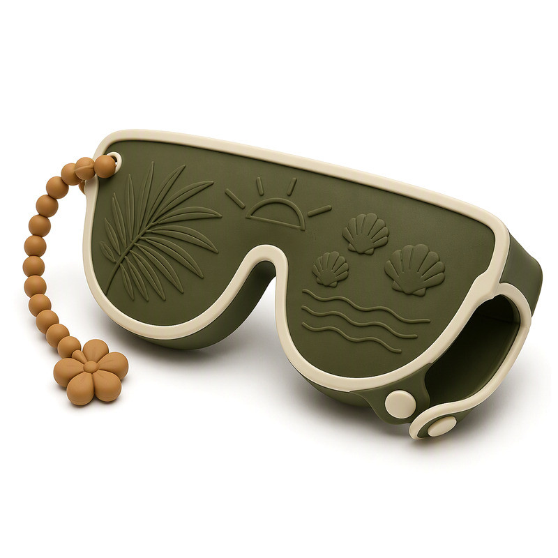
Integrated multicolour molding puts two or more compounds into the same part. It produces the cleanest result and the most durable boundary, because there is no adhesive and no assembly step to fail. It also concentrates risk in the tool: the shut-off has to be sharp enough to stop one compound entering the other's territory, and the process has to cure the first shot enough to survive the second without over-curing it.
Not every multicolour layout survives that constraint. Long, thin, isolated colour islands are difficult; colour that reaches the edge of the part is far easier, because the boundary can run out to the parting line instead of closing on itself.
This is why a technical review should happen before a designer commits to a layout. The question is not "can you do two colours" - most factories can - but "can you do this two-colour layout at this scale, with this tolerance, on this geometry".
Printed or Applied Details for Logos and Small Graphics
For fine graphics, printing is often the better answer, and choosing it is not a compromise. Screen printing and laser etching handle detail that a molded colour boundary cannot, at a much lower tooling cost, because the artwork lives on a screen rather than in steel.
The trade-off is durability and depth. Printed decoration sits on the surface, so its life depends on adhesion and abrasion rather than on the compound. A molded feature is the compound. The comparison between screen printing, heat transfer and laser etching is worth reading before deciding, because the three behave differently on a soft, low-surface-energy material.
What Should You Consider When Matching Brand Colors?
Provide Reference Codes and Physical Samples Where Available
A Pantone reference is a starting point, not an approval. The same reference looks different on coated paper, on a plastisol chip and on a matte silicone surface. Send the reference code plus, if you have one, a physical object in the colour you actually want - a previous product, a fabric swatch, a printed carton.
Then agree which one governs approval. If the code and the physical sample disagree, the sample should usually win, because it is what the customer will compare against.
Review Color Appearance on the Actual Silicone Surface
Silicone scatters light differently from plastic. A matte surface lifts and flattens colour; a gloss surface deepens it; a textured surface shifts it further. Add the viewing condition - daylight, retail spot, phone screen - and the same compound can look like three different colours.
The practical method is to approve on a molded sample under agreed light, and to record which light. Where colour difference needs to be quantified, ASTM D2244 provides the calculation methods for instrumental colour difference and tolerance, which is what a documented approval should reference rather than a verbal description (ASTM D2244).
Check Whether Different Colors Look Consistent Across Production Batches
Colour drifts between batches for reasons that have nothing to do with carelessness: pigment lot, compound lot, cure temperature, and the age of the masterbatch. A brand that approves one sample and then orders three times a year will meet that drift eventually.
The defence is procedural. Keep a signed reference plaque, agree the light and the viewing distance, and state how much difference is acceptable. If a colour is critical, ask for the reference to be held by both sides rather than only by the factory.
Integrate a Logo Without Overcomplicating the Design
A logo can be molded into the cavity, raised above the surface, debossed below it, printed, etched, or supplied as a separate applied part. Each choice changes tooling, unit cost and how the mark ages.
Molded and debossed marks are the most durable because they are the material. Printed marks are the most flexible and the least permanent. The right answer usually follows from one question: does the mark need to survive two years of a bag, or one season of retail?

Keep Logo Details Clear at the Actual Product Size
Reduce the artwork to final size on paper and look at it at 300 mm before approving anything. Lines under about 0.4 mm, tight letter spacing and fine serifs are the first things to disappear - not because the mold is imprecise, but because the material cannot hold an edge that thin once it is released from the cavity.
Contrast matters as much as line weight. A dark motif on a light body reads from a metre away; the same motif in two neighbouring mid-tones reads only up close. If the brand mark is meant to be noticed, give it contrast rather than detail.
Which Design Details Can Create Problems During Molding or Assembly?
Very Thin Color Sections and Narrow Decorative Features
A colour island 0.8 mm wide is a tooling problem before it is an aesthetic one. Compound has to fill it, cure it, and release it without tearing, and the mold has to shut off around it without crushing the adjacent colour. When a feature is that narrow, it is usually better printed than moulded - and usually better simplified than either.
Undercuts, Tight Corners, and Uneven Wall Thickness
Multicolour parts tolerate less geometric freedom than single-colour ones, because two compounds shrink differently and the boundary amplifies any mismatch, which is why ISO 3302-1:2014 tolerance classes are worth agreeing before the tool is cut. Sharp internal corners concentrate stress and are where a colour boundary is most likely to show a witness line. Uneven walls make the two shots cure at different rates, which is a common reason a sample looks perfect and a production run does not.
None of these are automatic failures. They are the specific places to review on a section drawing before the tool is cut.
Interfaces Between Different Components
If the design uses separate parts, the joint is the product. Slot depth, post diameter, strap thickness at the loop, and the clearance that lets the parts assemble without forcing - all of it needs to be evaluated as an assembly, not as two drawings that each look fine.
A useful check is to ask what happens at the extremes: thinnest strap in the tolerance band, widest slot, coldest day. A joint that only works at nominal dimensions will produce a complaint in the first winter.
What Should Be Checked During Sample Approval?
Confirm Color Boundaries and Logo Appearance
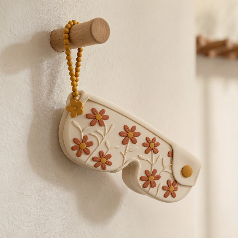
Put the sample next to the approved artwork and the reference plaque, in the agreed light. Check the boundary line for bleed, the small colour areas for fill, and the logo for closed counters and lost serifs. Photograph the result and attach it to the approval, so a later batch can be compared against evidence rather than memory.
Check Fit, Flexibility and Everyday Handling
Insert and remove the intended sunglasses. A multi-colour part is often slightly stiffer at the boundary, which can change how the mouth opens. Check that decorative relief does not catch on the frame or on fabric, and that the strap or band is comfortable where it will actually hang.
Inspect the Visible Quality of the Finished Product
Surface, flash, seams, colour contamination, alignment. Write the acceptance criteria down before mass production. "Good quality" is not a criterion; "no visible flash on the rim, no colour bleed at the boundary, no witness line taller than the surrounding surface" is something a supplier can inspect against - and something you can reject against, fairly.
What Should You Send a Manufacturer to Start Development?
- Overall sketch or CAD, with the opening direction marked.
- Target sunglasses dimensions and the size range to cover.
- Colour map with the number of colours and the essential boundaries.
- Brand colour references plus any physical sample you already have.
- Logo artwork in vector format and the intended application method.
- Preferred structure and closure concept.
- Expected quantity and packaging requirements.
- Reference photos of the look you are aiming for, clearly labelled as reference rather than specification.
That package is enough to review feasibility, propose a construction, and price the tooling honestly. FromRubber runs multi-colour silicone molding in-house alongside mold making, so the colour layout and the shut-off design are reviewed by the same people who will cut the tool.
Conclusion
A multicolour silicone sunglasses sleeve is not a colour palette applied to a shape. It is a set of boundaries that each need a place to close, a set of areas large enough to read, a construction route that decides whether colour lives in the mold or in the assembly, and an approval method that survives batch three. Get those four aligned and the palette takes care of itself.
If you are developing a branded sleeve and want the colour layout reviewed before tooling, send the colour map and the frame dimensions to our team, or reach Nani at nani@fromrubber.com. We will tell you which boundaries are straightforward and which ones will cost you a revision.
FromRubber is the brand of Dongguan Bohao Electronic Technology Co., Ltd., a custom silicone manufacturer based in Dongguan, China, molding since 2010. The company holds IATF 16949:2016, ISO 9001:2015 and ISO 14001:2015 certification and runs two plants with 32 compression molding presses.
FAQ
Can a silicone sunglasses sleeve be made in multiple colours?
Yes, but the number of colours is less important than the number and shape of the boundaries. Two colours with one clean boundary are usually easier than three colours with small isolated islands, and a layout that reaches the part edge is easier than one that closes on itself.
Is multicolor molding always better than assembling separate parts?
No. Integrated colour looks cleaner and holds up better at the boundary, but it concentrates risk in the tool and is less forgiving of design changes. Separate components are easier to tool, easier to re-colour later, and can be the more sensible choice for a first production run.
How should I provide brand colours to a silicone manufacturer?
Send the reference code and, if possible, a physical object in the target colour, then agree which one governs approval. Screen colours are not a reliable standard on their own, because silicone, surface finish and lighting all shift the result.
Can a small logo be integrated into a multicolor silicone sleeve?
Often yes, but size works against you. Below roughly 0.4 mm line width, fine detail starts to close up or disappear, and contrast between the logo and the surrounding colour becomes more important than the artwork itself. Very small marks are frequently better printed or etched.
What should I check before approving a multicolor silicone sample?
Colour boundary quality, fill in small colour areas, logo legibility at final size, fit with the actual sunglasses, and visible defects such as flash, seams and contamination. Record the checks with photos and a written criterion so later batches can be judged against the same standard.
Sources
ASTM D2244-21, Standard Practice for Calculation of Color Tolerances and Color Differences from Instrumentally Measured Color Coordinates. astm.org/d2244-21.html