
Small Silicone Logo Design on Clothing: How to Keep Thin Lines Visible?
The artwork looks crisp on the screen at 400%. Then the first moulded sample lands on the desk and the same logo reads like a smudge: the thin outline has blurred into the fill, the two smallest letters have closed up, and the gap between the monogram and its frame is gone. Nothing was printed badly. The decision that caused it was made much earlier, in the geometry of the artwork itself.
A small silicone logo is not a picture. It is a small three-dimensional part with raised walls, recessed channels and flat colour fields, and every one of those features needs physical room. When the logo is scaled down, the overall outline stays recognisable while the features inside it shrink in a way the eye does not notice on a screen. Line width, the gap between two lines, the counter of a letter such as a or e, the wall of a moulded rib — these are the values that decide whether the finished logo is readable, not the outer size printed in the specification.
Where the Detail Actually Goes Missing
On a screen, a line one pixel wide is still a line. In a moulded part, a line is a volume of rubber that has to be filled, vulcanised and then released from a mould without tearing. Two surfaces also have to be far enough apart for the eye to register them as separate, and for the material to flow into the space between them. Below a certain scale, those two requirements start to compete: a shallow recess becomes almost the same height as the surrounding surface, and a narrow gap between two raised lines fills more slowly than the rest of the cavity.
That is the reason a logo can pass a visual check on the drawing, fail a visual check on the sample, and still be within dimensional tolerance. ISO 3302-1:2014 sets the dimensional tolerance classes normally applied to moulded rubber products, and those classes govern the part; they say nothing about whether the part is legible. Tolerance is measured on defined dimensions. Readability is measured by the eye, on the finished part, at the distance it will be seen.
Look at the image on the right. The letterform is wide and bold, so it holds its shape easily. The hairline square frame around it is the feature that decides whether the product looks deliberate or accidental. A frame like that is usually the first element a buyer will thin down when trying to save space, and it is the first element that fails.
The practical point: do not judge the logo by whether you can still see the frame on your monitor. Judge it by whether the frame is separated from the letter by a real, measurable distance at final size, and whether that distance is realistic for the material and the mould.

Which Thin-Line Features Fail First
Narrow raised lines
A raised line is a thin wall of rubber standing above the base. As it gets thinner it also gets more flexible, so it can lean during demoulding and arrive slightly deformed. The failure is rarely a complete tear; more often the wall becomes uneven along its length, and an uneven line reads as a wobbly one.
Narrow recessed lines
A recessed line has the opposite problem. Its legibility comes from the shadow it casts and the contrast between the floor of the groove and the surrounding surface. Make the groove shallow and narrow at the same time and there is almost nothing left to see from any normal viewing angle. A recess also depends on the tool having a fine, robust rib that can survive many cycles.
Small text and enclosed counters
Letters with enclosed spaces — a, e, o, p, R, B — need the counter to remain open. Close it and the letter becomes an ink blob with an outline. Small text also brings stroke weight into play: a light weight in a condensed face has very little material behind each stroke once it is moulded, while a heavy weight in the same face closes the counters from the other direction.
Closely spaced lines and small gaps
Two adjacent features merge when the space between them is too small for the process to resolve. This is the most common cause of a logo looking muddy at reduced size, and it is also the easiest to fix, because a small increase in separation costs very little visual identity.
Fine details near the edge
Features close to the perimeter sit in the busiest region of the part: that is where material flow changes direction, where the part is trimmed, and where the edge is most easily damaged. A delicate element placed 0.5 mm inside the outline is far more exposed than the same element in the middle.
None of this means that thin lines always fail. Feasibility depends on the combination of geometry, dimensions, material, mould design and process capability, and two suppliers with different tooling can give different answers on the same drawing.
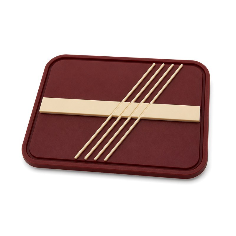
Where lines cross a solid element, the crossing point is where separation is easiest to lose. In the sample on the left, several hairlines run across a bold bar. The bar is not the risk; the hairlines and the space around them are.
A useful habit when reviewing artwork at this stage is to mark every place where a thin element touches, crosses or runs parallel to a solid element, then check those points at final size before anything else.
What to Change Before Tooling
Increase thickness where the identity allows
The instinct is to thicken everything by the same amount. A better approach is to thicken only the features that are currently marginal, and to leave the features that already read well alone. There is no single minimum line width that is valid for every silicone logo, because the answer depends on the target material hardness, the mould construction and the surface finish.
Published design guidance for liquid silicone rubber gives a useful anchor. In that guidance, walls as thin as 0.010 in. (0.254 mm) are described as achievable, subject to the size of the wall and the thickness of the sections next to it; ribs are normally specified at 0.5 to 1.0 times the adjoining wall thickness, and tooling tolerances in the region of ±0.003 in. (±0.08 mm) are quoted as typical for the process. Those figures explain why a nominal 0.175 mm line is not the same thing as a line that reads — and why the surrounding geometry, not the line on its own, decides the outcome.
Increase the spacing between adjacent elements
Separation is usually cheaper to give away than line weight. Widening a 0.4 mm gap to 0.6 mm changes very little to a viewer and a great deal to the process.
Simplify what carries no meaning
Decorative borders, secondary ornaments and micro-slogans are the first candidates for removal. Keep the elements that a customer uses to recognise the brand, and simplify the ones that only add texture.
Adjust tiny text and enclosed spaces
For text below a certain size, changing letter spacing, stroke weight or even the typeface does more than changing the font size. A slightly wider face with heavier strokes and more open counters will usually survive a size reduction better than a condensed one.
Protect the features that carry the brand
Decide in advance which features must remain visible — often the mark itself, the brand initial, or one distinctive shape — and treat everything else as negotiable. That single decision turns an argument about taste into a list of measurable constraints.
An illustrative example, not a specification
Suppose a 30 mm wide mark carries a 0.35 mm outline, three letters at 2 mm cap height and a decorative rule 0.3 mm from the mark. Proportionally scaling the whole file to 15 mm halves every one of those values, so the outline becomes 0.175 mm and the gap becomes 0.15 mm. At that point the correct move is not to shrink the file, but to enlarge the outline, open the gap, drop the decorative rule and keep the letters at a workable height. The numbers here are for illustration only. For context, published design guidance for liquid silicone rubber places the practical lower limit for a moulded wall at roughly 0.25 mm, and even that figure is conditional on the surrounding geometry, the material and the mould. The workable values for a specific project come from the material and process being used, confirmed on a sample.
Size, Viewing Distance and the Proportional-Shrink Trap
Reducing a file proportionally is the single most common cause of a muddy result, because it preserves the relationships that made the large version work and destroys the absolute values that made it manufacturable. What matters is the absolute value of the smallest feature at final size, and the distance from which the logo will be read. A 12 mm logo on a chest is read from about a metre; the same logo on a sleeve hem is read from half that distance, and the acceptable level of detail changes accordingly.
| Element at final size | What it controls | What usually goes wrong |
|---|---|---|
| Thinnest raised line | Whether the line stands consistently along its length | Uneven height, wobble after demoulding |
| Smallest gap | Whether two elements stay visually separate | Merging into one shape |
| Smallest text cap height | Whether letters are identifiable at all | Counters closing, strokes disappearing |
| Feature depth | Whether a recess reads as a recess | Flattening into the surrounding surface |
| Wall-to-rib ratio | Whether a narrow rib fills evenly along its length | Rib noticeably thinner than the adjoining wall |
| Clearance to the outline | Whether edge detail survives trimming and wear | Chipped or blurred perimeter detail |
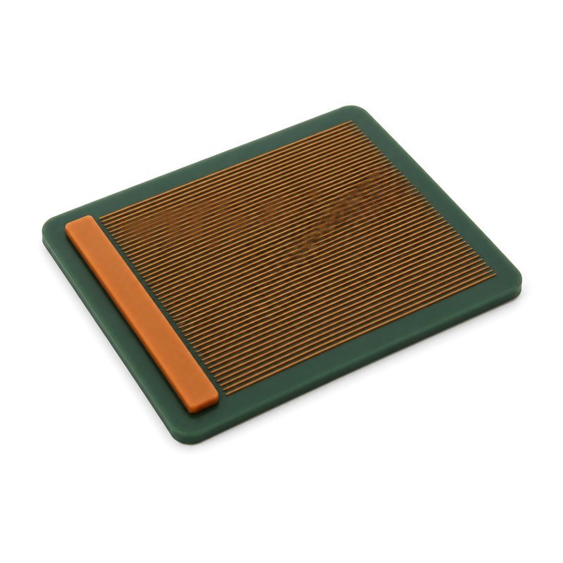
Density is the other variable. A field of many fine lines can look elegant in vector form and turn into a grey panel once moulded, because each individual line loses a little definition and the losses accumulate.
If a design depends on this kind of density, test it at final size on the real material before committing to tooling. Reading it on a printout of the artwork is not the same test.
How Material and Surface Finish Change What You See
Hardness and deformation
Softer compounds deform more easily under handling, so fine raised detail can be pushed flat by ordinary wear. Harder compounds hold small geometry better but feel different against skin and may need different bonding conditions for the attachment method you have chosen. A single hardness value is not a guarantee of better detail; it is one variable in a trade-off.
Matte versus glossy surfaces
Surface finish changes how light interacts with the part. A matte face scatters light and reads fine raised lines as slight tonal steps, which is often enough to make a thin line legible. A glossy face produces specular highlights that can either pick out a thin line beautifully or wipe it out completely, depending on the angle. Test under the lighting the garment will actually be seen in, not under a single-point studio lamp.
Raised versus recessed versus flat colour separation
Raised features read through shadow and touch. Recessed features read through shadow and depth. Flat colour-separated elements have no height difference at all and depend entirely on contrast between two materials, which usually means a wider minimum separation between colours than a height difference would need.
Contrast helps, but cannot repair geometry
Strong contrast between the logo and the garment improves perceived sharpness and is worth having. It cannot recover a merged gap or a closed counter. Fix the geometry first, then use contrast to make the good geometry easier to see.
A Sampling Check That Catches Most Problems
- Confirm the final logo dimensions in the specification, not just the file name.
- Review the artwork at the actual production size — a printout at 1:1 on paper is closer to reality than a magnified screen preview.
- Find the thinnest raised line on the part and look along its whole length, not just at its middle.
- Check the smallest gap with a loupe or a macro photo, and check it again after the sample has been handled.
- Read the smallest text from the distance the customer will read it, in the lighting the garment will be worn in.
- Compare the sample against the approved artwork at the same size, side by side.
- Confirm the sample is compatible with the intended attachment method before approving the design.
- Approve the sample, in writing, before mass production begins.
Enlarging a design during review hides exactly the problems that appear at finished size. Reviewing it small is the whole point of the exercise.
What to Send a Silicone Logo Manufacturer
- Vector artwork or a high-resolution design file, with fonts converted to outlines.
- Target logo width and height, in millimetres.
- Garment type, fabric composition and the area the logo will sit on.
- Required logo thickness and the surface appearance you want (matte, satin, glossy).
- Intended attachment method: moulded and sewn, direct screen printing, or a heat transfer label.
- Colour requirements, including whether a second colour is needed and where it sits.
- A mark-up or reference image showing which details must stay visible.
With that information, a manufacturer can review the file, name the features that will be difficult, and propose adjustments before tooling or sample production. That conversation is much cheaper than a second mould.
Frequently Asked Questions
Why do thin lines disappear in a small silicone logo?
Because a moulded line is a physical volume, not a printed mark. As the logo shrinks, line width, feature depth and the gap between neighbouring elements all shrink with it, and the process eventually cannot resolve them separately. Small changes in dimensions, material and mould design shift the point at which that happens.
Can a silicone logo reproduce very small text?
It depends on cap height, stroke weight, letter spacing and font structure, and on which of the three production routes is used. Removing or enlarging the smallest text is often the most efficient single change, and the result should always be judged on a sample at final size.
Should thin lines simply be made thicker?
Sometimes, but selectively. Thickening only the marginal features preserves the look of the ones that already read well, and a uniform increase across the whole mark is usually unnecessary. There is no universal minimum line width that suits every silicone logo.
Are raised or recessed lines better for small logos?
Neither is universally better. Raised lines give a tactile step and usually read at a slightly smaller width; recessed lines can look more restrained but depend more on depth and lighting. The right choice follows the material, the finish and the way the logo will be viewed.
Can the same logo keep its detail when reduced in size?
Rarely if the file is scaled proportionally. Reducing the file scales down the smallest features as well as the largest, so the artwork normally needs to be redrawn for the smaller size rather than resized.
Sources and further reading
- ISO 3302-1:2014, Rubber — Tolerances for products — Part 1: Dimensional tolerances. https://www.iso.org/standard/62492.html
- Liquid Silicone Rubber (LSR) moulding design guidelines, including wall thickness and feature considerations. https://www.protolabs.com/services/injection-molding/liquid-silicone-rubber-molding/design-guidelines/
- Typography: readability and legibility — stroke weight, spacing and why thin strokes disappear when reversed. https://www.sitepoint.com/typography-readability-and-legibility-part-1/
- Durometer testing guide, covering ASTM D2240 and ISO 48-4 hardness measurement and its effect on part behaviour. https://www.worldoftest.com/articles/guide-durometer-testing-rubbers-plastics/
Reading a drawing at final size, marking which features carry the brand, and checking the smallest gap on a real sample will prevent most of the rework that small silicone logos generate. The features that read well on the part are the ones that were given room in the artwork.
About this guide
This article was prepared by the engineering team at FromRubber (Dongguan Bohao Electronic Technology Co., Ltd.), which produces custom moulded silicone logos and clothing labels, silicone screen-printed labels and silicone heat transfer labels. The team reviews artwork for manufacturability before tooling, using the same feature-by-feature check described above.
If you are specifying a small silicone logo, send the artwork, the target size and the garment fabric. Related product pages: Custom Silicone Label, embossed 3D logo silicone labels and 3D pattern silicone labels for clothes, caps and shoes.